11x17 Poster
 Coming back from winter break we had done research on a graphic artist or movement. I got to convey the work of Massimo Vignelli. Vignelli believes in the functionality of all designs and I feel like by keeping my poster simple and using his favorite font, Helvetica, I portrayed him well. After writing our paper and making a slide show to share the thoughts and accomplishments of our designers, we took about a week to sketch and design a poster which shared information about an art exhibit showing our designers work. Some challenges I faced working on this project included making his work have my touch. I wanted to keep his work as authentic as I could but also show the effortless change design has. By facing these challenges I learned that your peers can help you most in times of struggle. My neighbors would help me think outside of the box and talk through my ideas with me so I could portray Vignelli as he is but also as I am. I was told to adjust the address at the bottom so it wasn't too distracting. I was also advised to turn the opacity of the M in Mass down so it fits together better. I ended up rearranging some things so it fit better together to make it more visually appealing. I really like my Poster because I feel like I took my research to heart and not only applied his ideas to this project but i have begun to apply his ideas and theories to other Projects I am currently doing.
 5x5 Typography Art Boards
The 5x5 Typography art boards were supposed to convey our personalities. Most of my quotes were about happiness and over coming obstacles. After a few days of sketching 20 designs and deciding which ones portrayed me the best, I took my designs to Adobe Illustrator. After putting them in black and white to test the functionality, we were assigned to pick a different color scheme for each design to enhance our work. I learned to always save An .ai file and a .pdf because if you only save a .pdf it makes it so you have to go through a lot of unnecessary work to edit your designs. I was told to fix my alignment on a few of the quotes. Overall, The assignment was a fun test of our abilities and it helped me develop an artistic eye for not only fonts but the way words can be manipulated to tell a story.

"Choose Happy"
I chose this quote because I believe people can choose to be happy or they can stay stuck in sadness. I chose purple because it reminds me of spring. During the spring time people are happy because it's getting warmer outside and the floors are blooming so I wanted that to symbolize happiness.

"Be kind or be quiet"
To me the quote be kind or be quite is very relevant to people of my age. Weather its people who don't like another person for the way they dress or if it's because the color of their skin, if you don't have anything nice to say don't say it at all. I wanted to get the message across with the word "quiet" fading away because I feel like it makes the piece more visually appealing.
"I like you a latte"

I really appreciate cheesy pickup lines and coffee so I decided to put those two things into my graphic design. I wanted to make this one simple but unique. When sketching this at the beginning it looked nothing like how it looks now. I had no idea how to get everything to fit. When I go home I started looking at mugs and I saw most of the mugs I have at home have writing in them so that's when I decided that Latte shoal be the base of the mug.
"I may not be there but I am closer than I was yesterday"
 This quote is the most important quote to me because it reminds me of my mom. My mom was diagnosed with Breast Cancer last year and she defeated it. I wanted a quote that really stood for everything she did when she was going through treatment. I made the word "yesterday" cursive because I wanted it to be ribbon like. I didn't create a colored version because i felt like the quote said so much and I didn't want to change anything about it. If I could redo it, I would make it cleaner and I would align things better.
 Combination Mark Logo
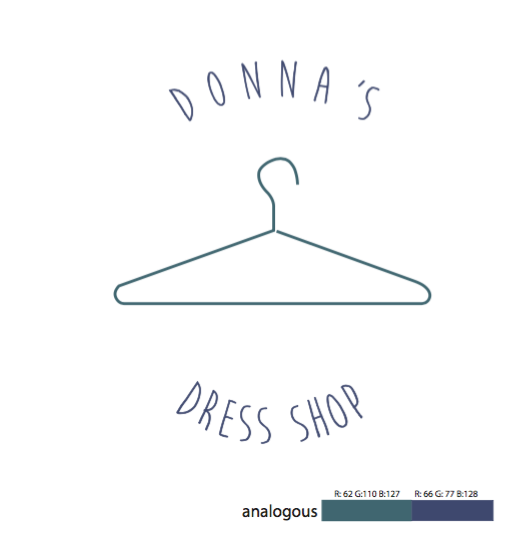
The assignment was to rebrand a local business. I chose to rebrand Donna's Dress Shop because of its fun loving environment and unique products. To start the project we researched and wrote a short paper about the company. Once that was typed and ready we met with a peer and read it to them. While we read it to them, they were to jot down buzz words that stood out to them and that could help with your design thought process. Some of my words included: Fun Loving, Happy, Vintage, Typewriter, New, Old, and unique. After we got our buzz words we sketched 30 symbols (only images) 20 word marks(only words) and 10 combination marks (words with
images). We chose six of our designs to put in Adobe illustrator. We were expected to pick six different color schemes for each design and pick out favorite one for our final logo.
Business Card
 The assignment was expanding off of the Combination Mark Logo. After rebranding Donna's logo, I was assigned to make a business card for an employee to give a potential costumer. I chose a dull blue to give off the vintage feel and put my logo on the back side of the card as an attention grabber. On the front of the card, "Donna's" is written in typewriter keys to show the vintage, fun, and unique feel of the company. I took about three days to finish my cars. I was told to add more color and stick to one logo and I made all of the requested adjustments. Along the way I learned that even if you think your deigns are as good as they can be to take what your peers say into consideration because together it may look a lot better. I would have liked my designs better if I picked more flashy colors to really draw your eye to the card but I am happy with the outcome.
Letter Head
 Another expansion to the rebranding project was making a letter head your company could use to address important business information to their clients. I took two days to complete my letter head. I decided to stick with the same colors that are in my business card so they looked like they were a part of a package. I faced difficulties with making sure everything was on the letter head but nothing distracted from the formality of the product. I was told to stick with once logo for this assignment so that everything would fit nice together and look like they belong. Overall, I like my letter head and I believe it meets the criteria for the assignment.
Envelope
 My envelope for Donna's is supposed to show the vintage feel like my other designs. I feel like if you saw this in the mail you would want to take it because its not a regular white envelope. I enjoyed getting to communicate with my peers to figure out how I wanted to go about this portion of the project. I learned to address an envelope correctly and what is visually appealing to other people. I changed the logos on this so it looked more consistent with the res of my designs.
In class I am focused when it's time to work but there are times I get off track and need to focus more on my designs and not the people around me. In times when I would finish early I would go and look at other peoples designs or i would find an extra credit project to begin to work on. I have Adobe Illustrator at home so in my free time I like to design stuff. In Hawaii, I went to an art gallery and I saw beautiful art so when I got home I decided to make designs of whales and water. I also made a visually appealing website where I sell stickers, photography, quotes and opportunities to make videos.
I am a very fun go lucky person but when it's time to work I crack down and I get things done. I feel like having that kind of personality helps me come up with creative ideas. I also think that being happy and ind to people gives you more opportunities to work with clients and sell your work.
I talk a lot in class. Sometimes it's Graphic Design related but most of the time it's about other things. Although I talk, I always get my work in on time and I am always ready to help anyone who needs it.
I loved my class this semester. I feel like I got very close to everyone and I am very glad I had the time to grow as a person and a designer. If I could change one thing I would want to do small group critiques instead of large group ones so we can get through more material and get useful feedback. Overall, I really learned to value my peers opinions and suggestions. With out this class I feel like I wouldn't take critiques as well as I could. Next year in eComm I hope to continue working in Graphic Design even though i'll be in entertainment. Mrs. Smith has been such an inspiring teacher and I can't wait to spend two more years with her learning about something i'm passionate about.
No comments:
Post a Comment